
The walls surrounding you do more than merely hold up a roof. They set the emotional temperature of your home, influence your mood each morning, and whisper the first impression to anyone who crosses your threshold. Yet standing in the paint aisle, faced with thousands of swatches that somehow all look identical yet entirely different, many homeowners find themselves paralyzed by choice. Professional interior painters understand that selecting the perfect palette requires more than simply picking your favorite shade—it demands a thoughtful assessment of your space’s unique characteristics and how you truly want to feel within those four walls.
The process might feel overwhelming, but it needn’t be. Understanding a few fundamental principles can transform you from confused paint-aisle wanderer into confident color curator. The secret lies not in following trends blindly, but in reading your rooms properly and responding to what they’re telling you.
Light Makes All the Difference
The direction your room faces fundamentally alters how colors appear throughout the day. North-facing rooms receive cooler, blue-tinged light that can make colors feel subdued and even slightly melancholic. Counter this by selecting paints with warm undertones—think yellows, soft creams, or greys with hints of warmth rather than starkly cool tones. Alternatively, embrace the cooler light by choosing darker wall colors that create a cozy, cocooning atmosphere rather than fighting against nature.
South-facing spaces, blessed with abundant sunshine, can handle both cool and warm colors beautifully. Blues and greens work particularly well here, helping to balance the intensity of strong natural light without the room feeling washed out. Meanwhile, west-facing rooms glow with gorgeous golden afternoon light but feel cooler in the morning, whilst east-facing spaces experience the reverse. Consider when you’ll use each room most frequently before committing to a color—if you primarily use your dining room in the evening, that warm western light might be perfect for rich, inviting tones.
The quality of light shifts not just by direction but by season too. Winter light tends to be cooler and sharper, while summer sunshine brings warmer tones. What looks perfect in January might feel completely different come July, so test your samples across different times of day and, if possible, across seasons.
Rethinking Space Through Color
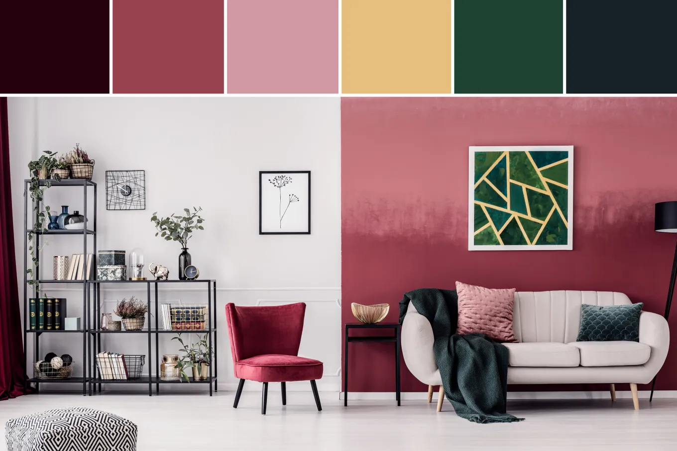
The conventional wisdom suggests painting small rooms white to make them feel larger, but interior designers increasingly embrace darker, richer tones that create an intimate, cocooning effect rather than fighting against limited square footage. Deep greys, earthy browns, or sumptuous burgundies can transform a compact bedroom into an opulent retreat. The key is committing fully—painting walls, trim, and even ceilings in the same darker shade eliminates visual interruptions and creates a surprisingly spacious feel.
If you prefer the expansive approach, off-whites and pale neutrals reflect light beautifully, but brilliant white can sometimes feel stark and cold, particularly in north-facing rooms. Soft, light neutrals in tonal schemes create a gentler environment that makes smaller rooms feel more spacious without the harshness. Warm whites with subtle undertones of beige or yellow add coziness without sacrificing the sense of openness.
For larger rooms that feel cavernous and unwelcoming, darker colors seemingly bring walls inward, creating a cozier atmosphere. The finish matters too—matt surfaces absorb light and enhance that enveloping quality, whilst glossier finishes reflect light and can make low ceilings appear taller.
Creating Flow and Harmony
A home isn’t a collection of isolated boxes but a connected experience. While there are no rigid rules about color, creating harmony between rooms helps establish a sense of cohesion throughout your home. This doesn’t mean painting everything identically—rather, consider how colors relate to one another as you move through doorways.
Many designers work with curated palettes that carry similar undertones throughout a home whilst varying intensity and hue. A soft sage in the hallway might connect beautifully to a deeper forest green in the living room, both sharing those underlying natural tones. Alternatively, painting all architectural details—skirting boards, architraves, window frames—in the same color as the walls reduces visual clutter and can make small spaces feel more generous.
Understanding Color Psychology
Beyond aesthetics, colors genuinely affect how we feel in a space. Blue rooms have been shown to slow heart rate and respiration, creating calm environments perfect for bedrooms or home offices where concentration matters. Green, created from combining yellow and blue, offers the most relaxing presence on the color wheel—no wonder it’s favored for spa bathrooms and restful bedrooms.
Warmer colors like yellow can boost mood and decisiveness, making them excellent choices for kitchens or dining areas. Orange brings energy without the intensity of red, encouraging lively conversation. Meanwhile, deeper purples convey sophistication and imagination, working beautifully in spaces where you want drama without aggression.
That said, color psychology isn’t gospel. Our reactions to color are deeply personal, shaped by culture, experience, and individual preferences. Some people thrive surrounded by nearly black walls, whilst others feel claustrophobic. Trust your instincts alongside the research.
Testing Before Committing
Purchase sample pots and paint large sheets of lining paper you can move around your room. Observe your samples at different times of day, in both natural and artificial light, noting how dramatically they shift. What looks perfect at noon might appear entirely different under evening lamps.
Even the type of bulb you use matters—halogen and incandescent create yellow light that warms colors, whilst cool white bulbs cast a bluer tone. Test your samples under your actual lighting conditions to avoid unpleasant surprises. If you’re particularly sensitive to color or want a specific look, consider the lighting fixtures you’ll ultimately use before making your final decision.
Trust Your Instincts
Ultimately, the most important principle is creating a home environment that feels uniquely yours, with colors that genuinely make you smile. Think about the hues you naturally gravitate toward in clothing, the environments where you feel most comfortable, and the mood you want to cultivate in each space.
Color establishes warmth, creates calm, expresses character, and informs every subsequent decorating decision you’ll make. Whether you choose the drama of jewel tones, the serenity of soft neutrals, or the energy of vibrant accents, your palette should reflect how you want to live within your walls. The right color palette isn’t found—it’s discovered through understanding your space, respecting its light, and listening to what makes you feel at home. Trust that process, test thoroughly, and you’ll create rooms that don’t just look beautiful but feel unmistakably, authentically yours.
Keep an eye for more latest news & updates on Hoseasons!